Web & Mobile Portfolio
Website Design and Implementation
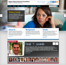
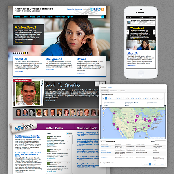
Health & Society Scholars
We designed it, built it, host it, they maintain it. A not-for-profit designed to build the nation’s capacity for research, leadership and policy change in health.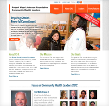
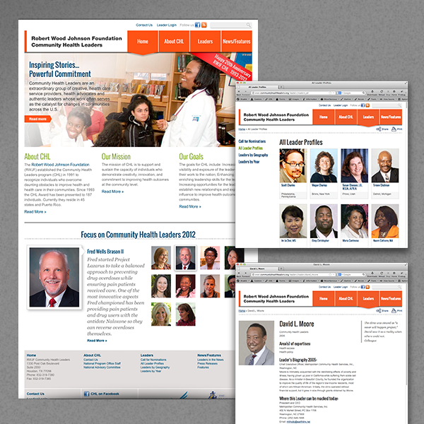
Community Health Leaders
We designed it, built it, host it, they maintain it. A not-for-profit to recognize individuals who overcome obstacles to improve health care in their communities.
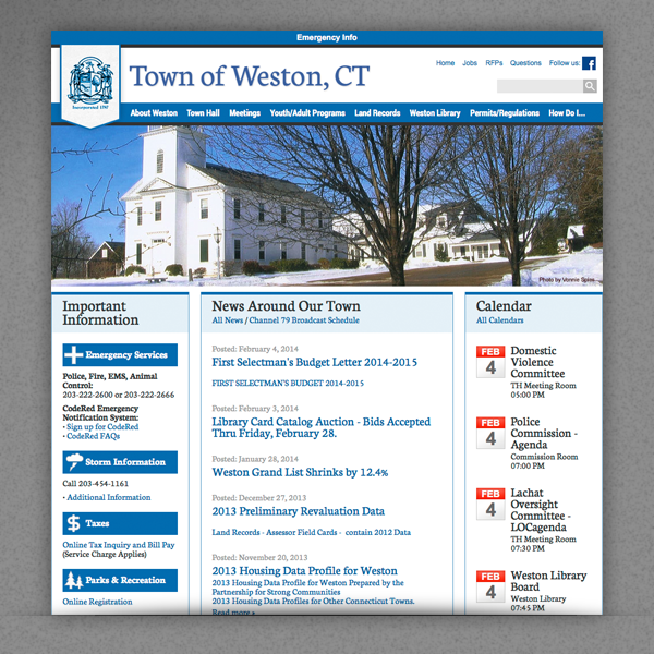
Town of Weston
We designed it, built it, host it, they maintain it. Weston is a residential community in Southwestern Connecticut.
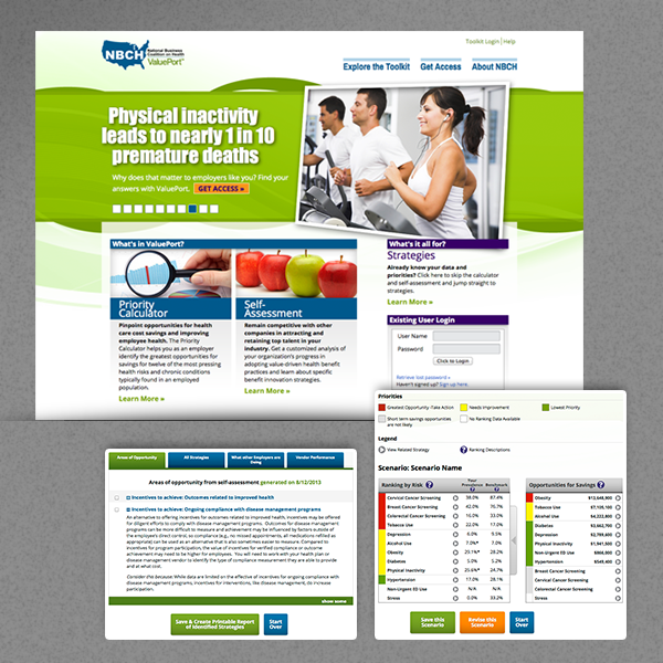
NBCH
We designed it, built it, host it, maintain it. A not-for-profit dedicated to value-based purchasing of health care services.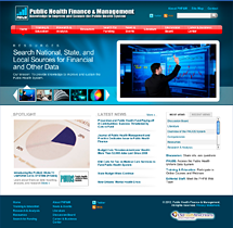
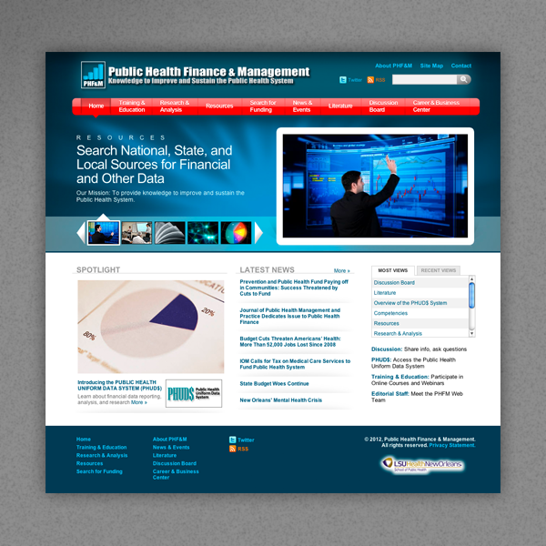
Public Health Finance & Management
We designed it, built it, host it, they maintain it. PHF&M is dedicated to making our public health system more effective.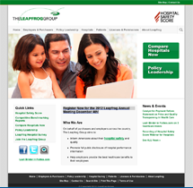
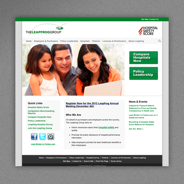
The Leapfrog Group
We designed it, built it, host it and maintain it. The Leapfrog Group helps make hospitals as safe as can be. Their hospital comparison and scoring tools are awesome.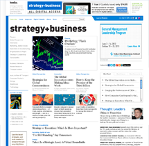
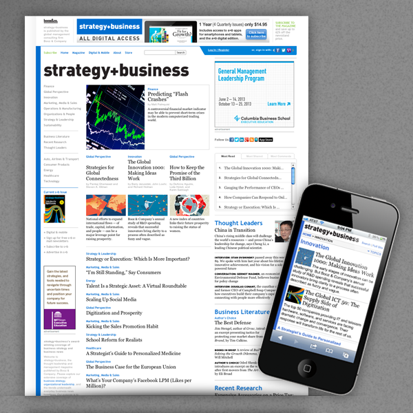
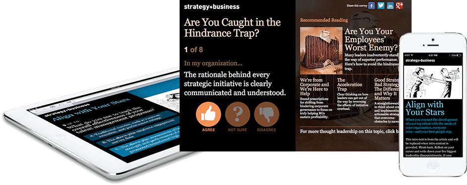
strategy+business
They designed it, we built it, host it and maintain it. This outstanding business magazine has been a client of Raven's almost since our start.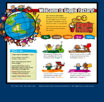
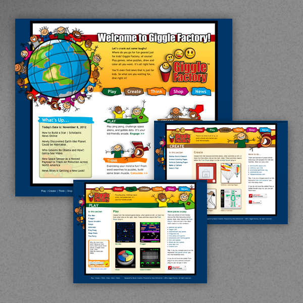
Giggle Factory
We designed it, built it, host it, maintain it. Giggle Factory is a safe haven on the web for kids to romp and frolic. Great mix of digital and offline fun.
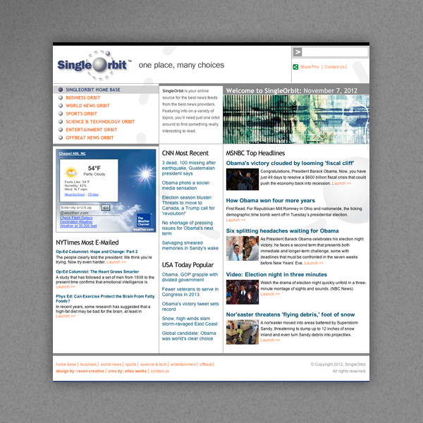
SingleOrbit
We designed it, built it, host it, maintain it. SO brings leading news, across several categories, from the best providers, together in one place.
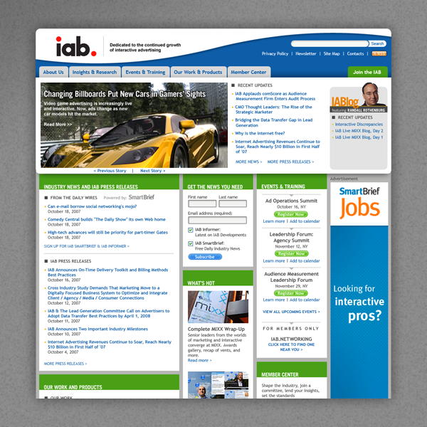
IAB
We designed it, built it, host it, they maintain it. Thanks to IAB, online advertisements are the most consistent and highest quality they have ever been.
Booz Allen Hamilton
They designed it, we built it and maintain it, they host it. A top-tier consultant, Booz Allen Hamilton invented an industry and they continue to lead it.
Whimsical Robyn
We designed it, built it, host it, maintain it. This is some of the most interesting (and heaviest!) artwork you'll find. We have it in our own homes.
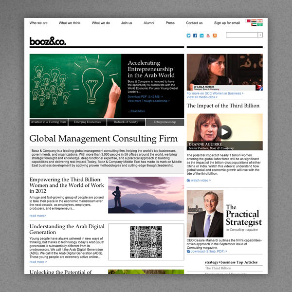
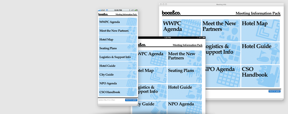
Booz & Company
They designed it, we built it, host it and maintain it. A top-tier consultant with multiple language sites and some of the most interesting infographics around.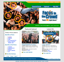
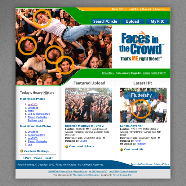
Faces in the Crowd
We designed it, built it, host it, they maintain it. FiTC is the quintessential Web 2.0 site...a place where social networking meets Where's Waldo?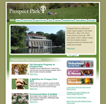
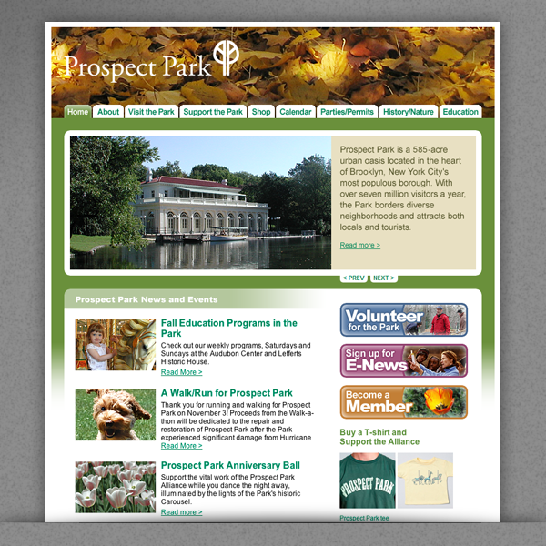
Prospect Park Alliance
We designed it, built it, host it, they maintain it. Prospect Park Alliance maintains a 585 acre wilderness in the middle of Brooklyn, New York!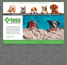
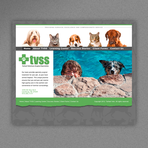
Tarheel Vets
We designed it, built it, host it, maintain it. Tarheel Vets is one of the area's finest providers of surgical services for pets. Two paws up.Mobile Development and Infographics
Interactive Surveys
We designed, built, host, and maintain them. They display custom outcomes based on user input and collected responses can be exported. These responsive surveys scale in scenarios from desktop PCs, tablets, all the way down to smartphones.
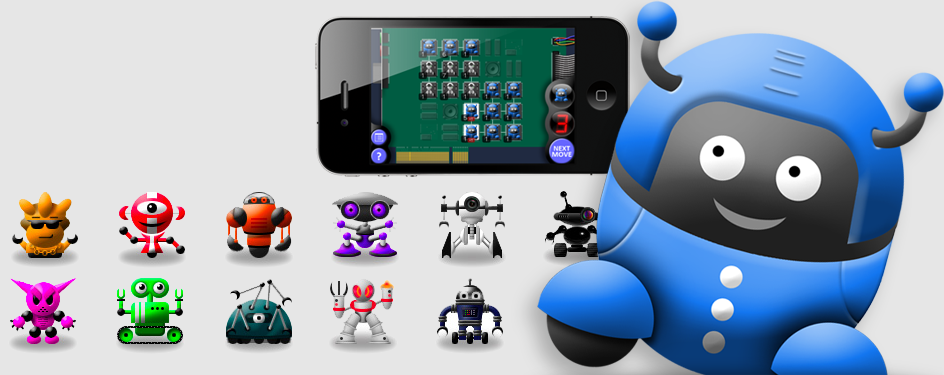
Speck: Pioneers
We designed it, built it, and maintain it for the iOS platform on iTunes. Speck is an iOS strategy game for iPhone/iPad. Think Risk but with tiny robots!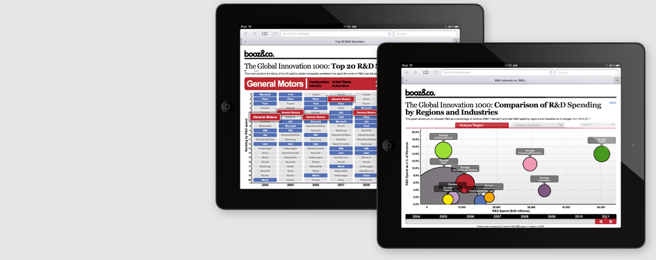
Dynamic Infographics
We designed them, built them, host them, help maintain it. Booz & Co. needed some sweet infographic goodness, sans Flash, of course. We put together these two dynamic goodies that are touch-screen friendly.
What's even cooler is that it's all fed by a client-managed database. Upload a new data file, get a whole new infographic.
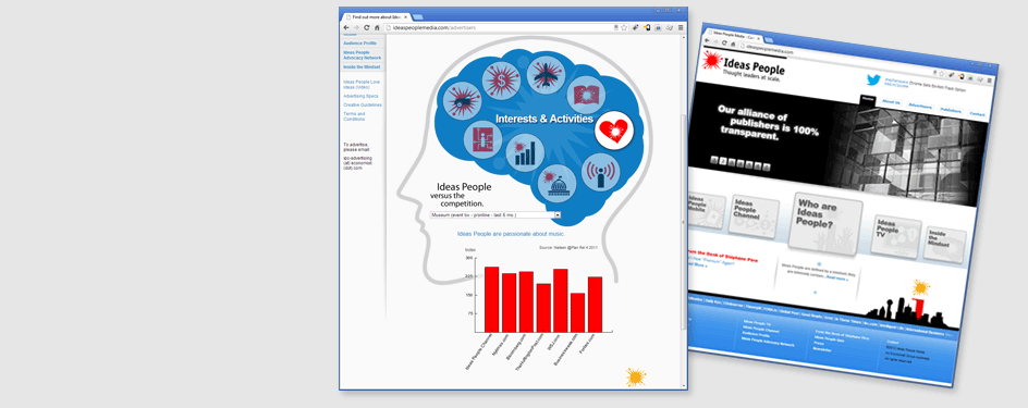
Database-Driven Infographic
We designed it, built it, host it, maintain it. IPM's "Inside the Mindset" graphic is a great example of a database-driven infographic. We started with the concept, designed supporting icons to match some from an existing set and built a database to drive it. Now, users click an icon and get a selection menu to display related data below. A great match of design and technology.
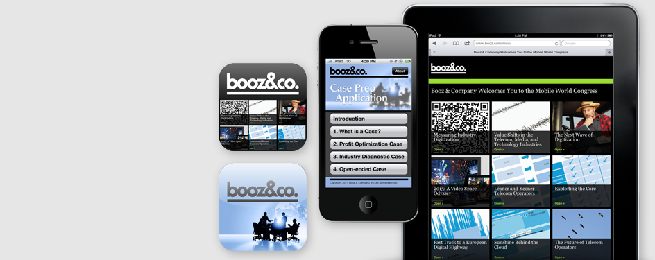
Web App, Native App
We designed these, built these, maintain these. These are really two separate apps. The one on the iPhone is a native iOS app to walk college students through case preparations. Simple but effective.
The second one on the iPad is a beaut. It's a web app that can actually be used offline. It updates itself when new files are pushed to it and then it can be taken offline and viewed in the comfort of a cozy chair, in the mountains, with no cell or wifi, and maybe some hot cocoa.
Responsive Design
We designed it, built it, host it, maintain it. This is a good example of some responsive design. It actually changes it size and shape depending on the device.
"Who needs that?" you say. Well, everyone now. Used to be just the iPhone, that's it. It came in one size and black. Later white, sometimes. Now you have big phones, little phones, big tablets, little tablets, retina, HD, HD+, ABCD, 1234, stuff like that. These layouts don't care. They stretch out and scrunch up as needed to fit every rectangle you can throw at them.